Relevant extensions were difficult to surface.
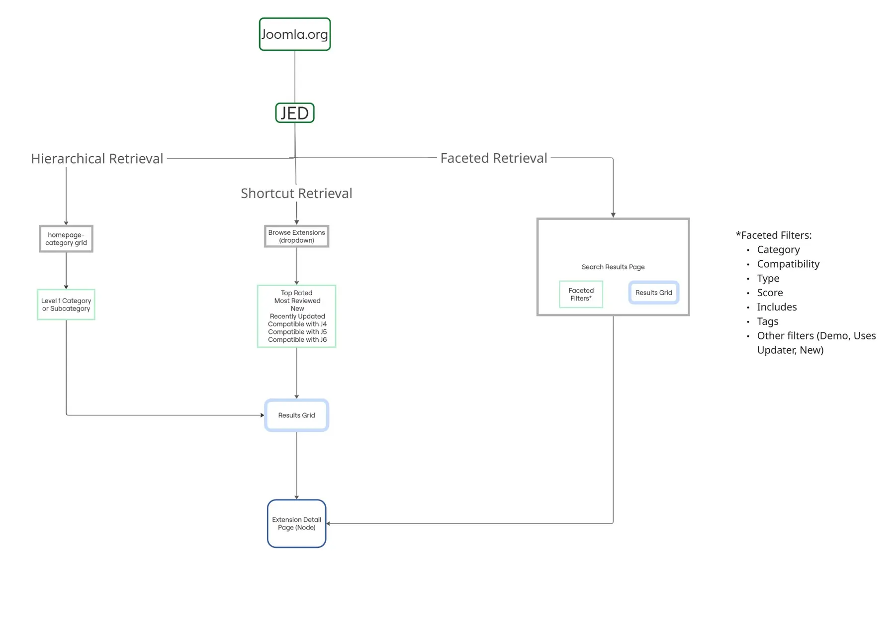
Users could search a large directory, but relevance, terminology, and filtering made the right option harder to identify.
Information architecture and search strategy redesign for a global open-source software marketplace.
The project in 30 seconds
Users could access thousands of extensions, but finding, comparing, and confidently selecting the right one required too much effort.
I researched the discovery journey, evaluated search and information architecture, and connected those findings to a practical redesign strategy.
Treat the directory as a decision-support experience built around intent, structured metadata, and comparison — not just a list of extensions.
Sole UX Researcher & Information Architect
12 weeks
Interviews, surveys, heuristic evaluation, competitive analysis
Figma, Miro, Google Forms, Cacoo
The challenge
Reduce search friction, surface compatibility, and rebuild the path from discovery to confident selection inside a long-running open-source ecosystem.
The JED hosts thousands of extensions across e-commerce, forms, security, SEO, and more. Users routinely invested significant time only to choose extensions that didn't fit their needs.
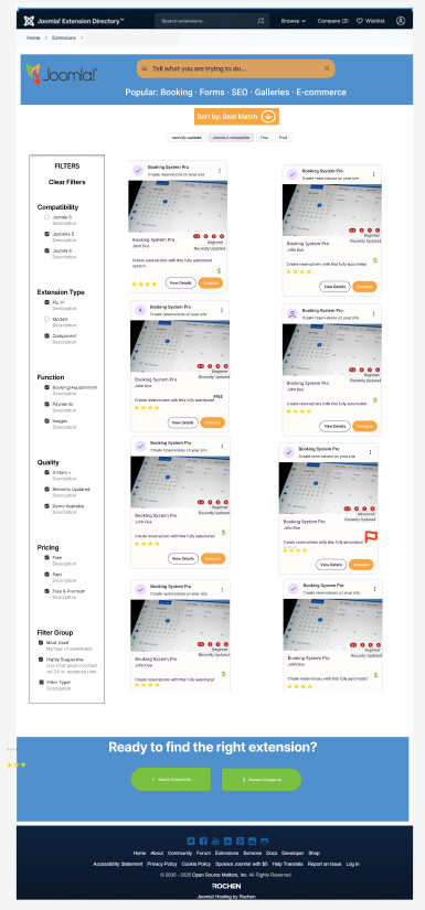
Users could search a large directory, but relevance, terminology, and filtering made the right option harder to identify.
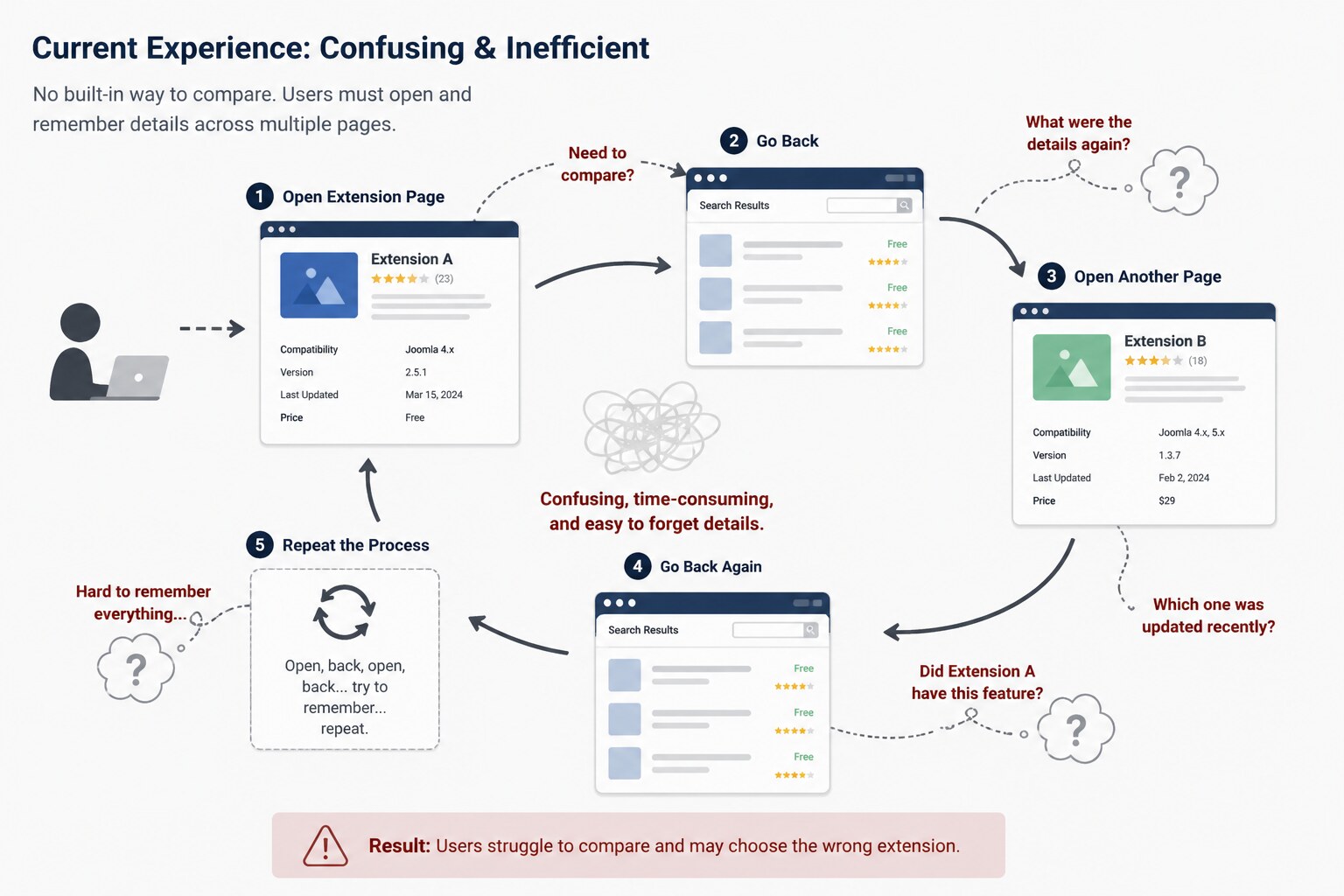
Compatibility and key differences were not always visible at the moment users needed to compare alternatives.
About 65% of survey respondents reported choosing an extension that ultimately failed to meet their needs after significant effort.
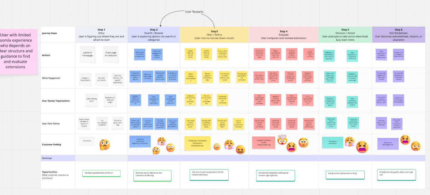
Connecting the dots
Different search language
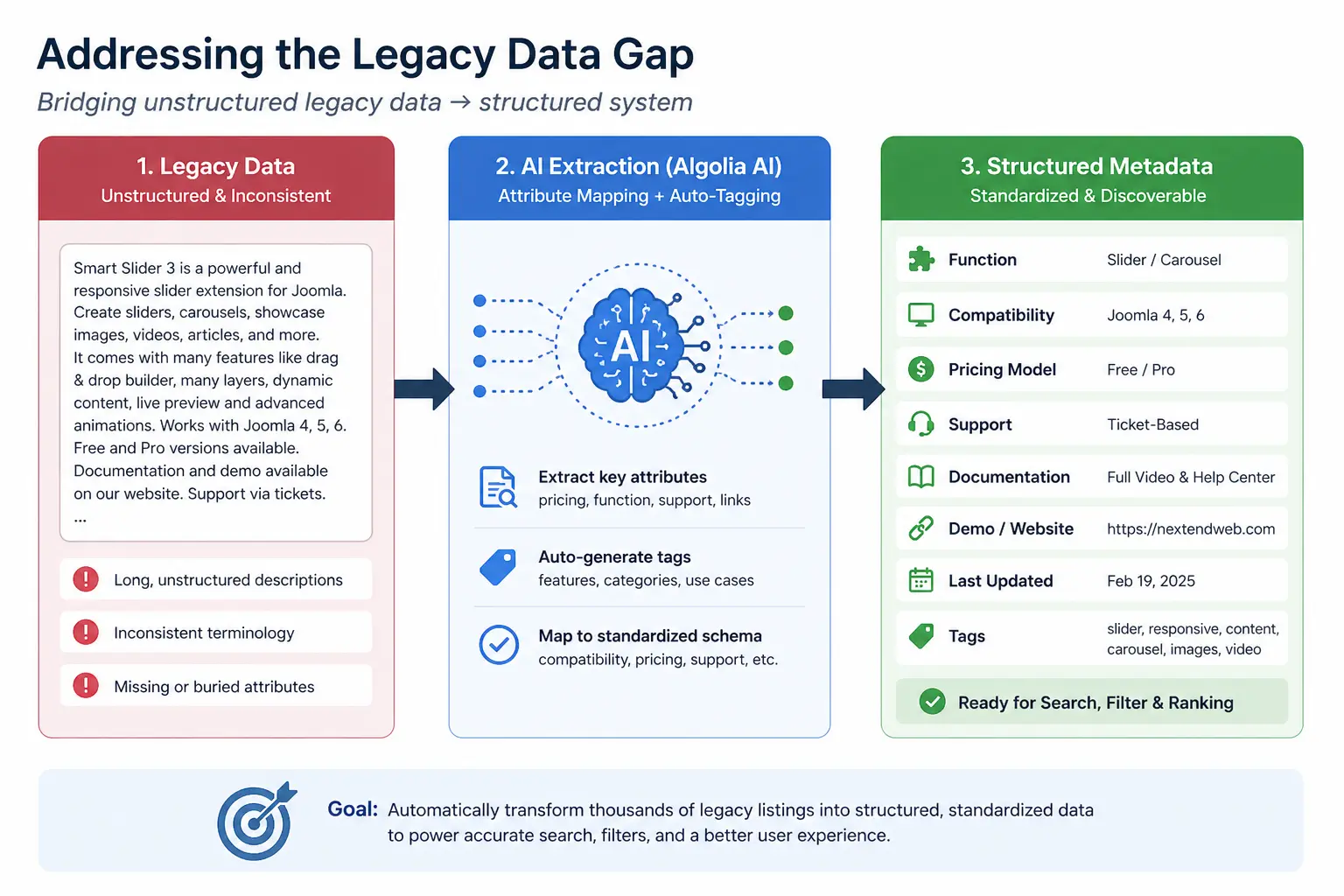
Inconsistent metadata
Scattered compatibility details
Search wasn't the real problem. The gap sat between user intent and how information was structured.
The solution direction
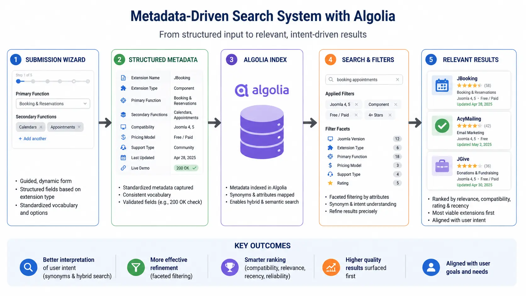
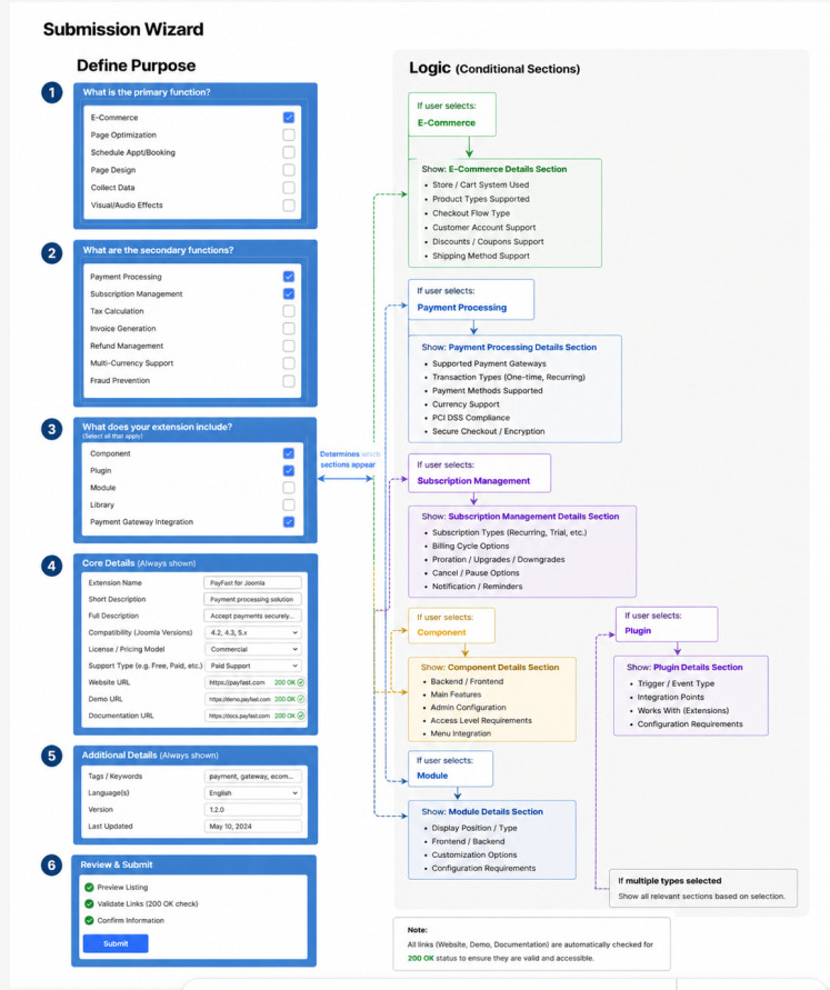
The recommendations work as a system: improve the information entering the directory, use that structure to sharpen discovery, and make alternatives easier to evaluate before users commit time to implementation.
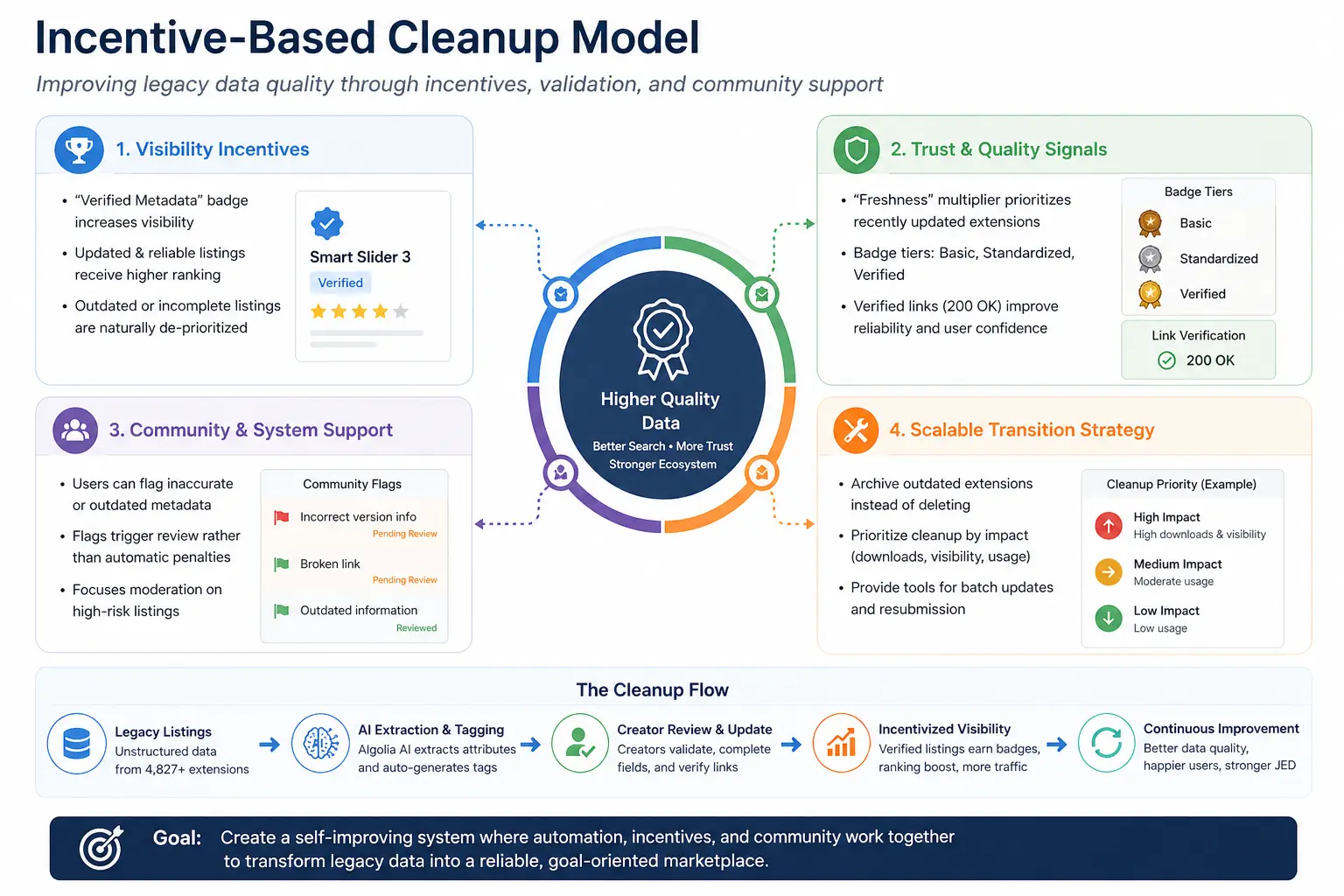
Standardized metadata and a guided submission wizard give search, filtering, and comparison more consistent information to work with.
Intent-aware ranking, clearer filters, and transparent match explanations help users understand why an extension appears.
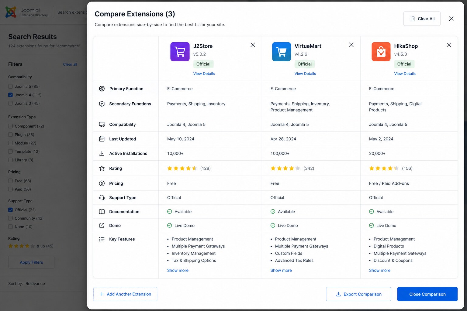
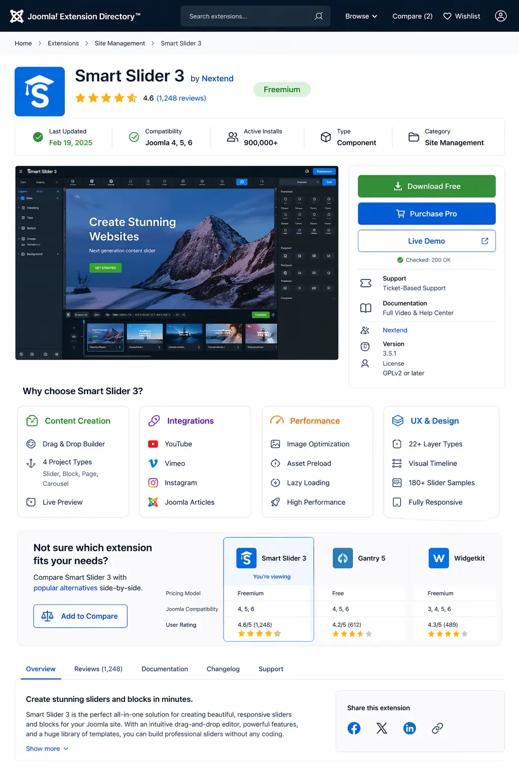
Comparable cards, compatibility details, maintenance signals, and side-by-side comparison reduce guesswork before selection.
Expected impact & next validation
Test whether users find suitable extensions faster, understand why results match, compare alternatives with less recall effort, and avoid unsuitable selections earlier.
Because this was a design recommendation project rather than a launched product, these are intended outcomes—not manufactured performance metrics.
Search isn't about retrieving results — it's about helping people decide. The information was there; it just wasn't legible, comparable, or trustworthy.
Answering a client's open brief by researching how job seekers actually work, identifying gaps and opportunities, and defining, prototyping, and testing the proposed product experience.